WITH its overarching theme of ‘longevity’, it’s quite appropriate that Design Manchester 13 features an appearance from London-based practitioner Kate Moross. Speaking alongside Mark Farrow, Peter Saville and festival curator Malcolm Garrett, it highlights what is an enduring relationship between music and visual work.
“The days of just doing a record sleeve are gone. What we find ourselves doing more and more is linking everything together. That’s what everybody seems to be looking for: subtle, cohesive brand strategies.”
And this has particular resonance given how Moross’ emergence as a creative force within music artwork happened at a time when many were lamenting the death of the physical format: when technology gurus had convinced the record industry that digital distribution meant that music should be unencumbered by crafted visual referents.
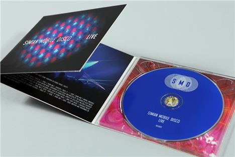
Moross, however, busily developed a reputation for eye-catching work within what others had assumed to be this increasingly invisible marketplace. Before long, her output was all over the then hugely popular MySpace. She was quickly acknowledged as the ‘go to’ girl for noisemakers needing a cool little logo for their page (and, in turn, counted the likes of the Young Turks label and Simian Mobile Disco as early clients).
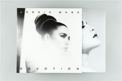
Through more recent expansion with the establishment of her successful Studio Moross (and as MySpace becomes little more than a friendless ‘Tom’ wondering if it was something he said), her music work has become even more prolific: taking in everything from videos, websites, 3D imaging, print campaigns, merchandise and even, on occasion, record sleeves for artists including Disclosure, Jessie Ware, Sam Smith, L-Vis 1990, Kwes, Cyril Hahn, Totally Enormous Extinct Dinosaurs, Banks and Washed Out.
“Physical formats aren’t exactly dead,” she says, “but I’ve realised that our canvas has really become everything else. When we do a CD cover these days, it tends to be for a promo CD - so it’s not really aimed at buyers. But that’s interesting as it has to work for taste-makers: for the press and radio people.
“The days of just doing a record sleeve are gone. What we find ourselves doing more and more is linking everything together. That’s what everybody seems to be looking for: subtle, cohesive brand strategies.”
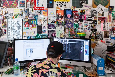
This is also where Moross’ enthusiasm seems to be. While still in her 20s, there have been significant developments within her work. Still known best for the bright colours that punctuate her own personal style and the geometric shapes that were once thrown confetti-like across her whole portfolio, she’s more than capable of exercising restraint and demonstrating elegance. The hand-drawn typography of her old flyer work, for example, is rarely to be seen these days. But there are still the comments of surprise when she directs a video shoot that “looks like a fashion editorial and doesn’t have any triangles in it”.
Perhaps like Garrett (whose work has moved through pivotal Buzzcocks sleeves to Duran Duran, Simple Minds, Peter Gabriel and beyond) and Farrow (with his Factory and Hacienda material through to the beautiful work that has emerged from his close working relationships with Pet Shop Boys and Spiritualized), this is key to that longevity: that ability to embrace change and truly explore its creative potential.
Design Manchester 13 will take place from 28 October-1 November
Kate Moross, Malcolm Garrett and Mark Farrow speak at Design Manchester 13 on Thursday 31 October at Manchester Town Hall, Albert Square. Visit designmanchester13.eventbrite.co.uk for tickets.
For more information on Design Manchester 13 visit www.designmcr.com or follow on Twitter @designmanchester.


