MANCHESTER has a new gentle giant.
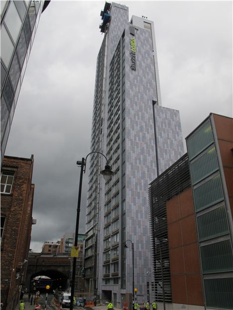
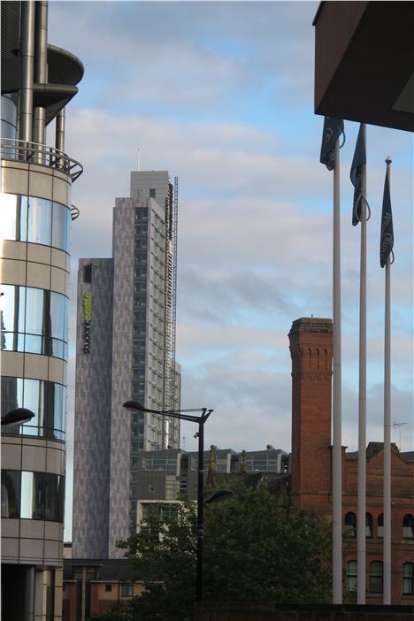
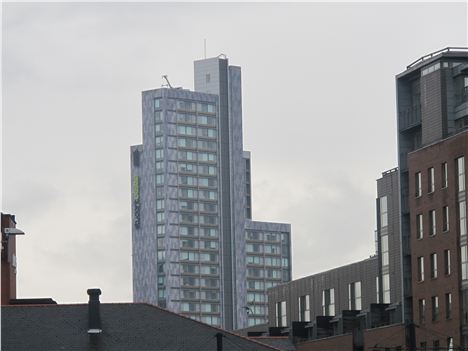
Almost unheralded and unnoticed the skyline of the city has just got better. Student Castle with its variegated profile of retreating and advancing planes and its up and down peaks is a cunning yet gentle presence on the horizon.
I love skyscrapers. I'd like Manchester to have more of them. I think people who complain about them would have us all still living in caves.
The building is by Manchester practice Hodder+Partners and is tall. At 106m (almost 350ft) it's a shade under City Tower's 107m. The tallest building in Manchester is of course, Beetham Tower at 168 metres, followed by the CIS Tower at 118m.
The developer is Student Castle itself, the engineers WSP. It cost £28.5m, is 37-storeys and provides self-contained studios, apartments and cluster flats of up to six bedrooms for 520 people.
Stephen Hodder of Hodder+Partners tells Confidential he wanted a building that was "tall, yet street relevant".
"We'd been working on the project before Student Castle came about," he continues. "Originally it was envisaged as apartments for developer Dandara over 21 storeys. We always knew that on an extremely tight site we had to respond to the scale of street and make the corner of our design at New Wakefield Street and Great Marlborough Street really do some work. So we always intended the tower would sit on a podium.
"Then Student Castle took over and it was clear that to make the business case it would need to go taller so we could fit more students in."
But what about the finished profile? One of the best things about Student Castle is that it's not a straight up and down shoebox design or even, as some have described Beetham Tower, an 'old-fashioned mobile phone."
"We wanted that variety. We wanted it aesthetically, and we wanted it for practical reasons," says Hodder.
"There’s a single core with four components and each presents a different profile. The clusters from the west are higher, because you get more views of Student Castle from distance on that side, so you need them bigger. On Oxford Road the view is foreshortened and so the scale of the building is much more fragmented, giving it more variety and flow.
"We've tried to express that lower down as well. The materials used in the building are there to express the types of accommodation. For instance the studio rooms look on to the railway, and are arranged in a saw-tooth so they look up and down the street rather than directly onto the railway.
"We've also provided a central corridor that is sheared in plan to allow natural light in - that doesn't happen frequently in corridors in student residences. With the rooms themselves you could say we've made a return to early accommodation in early colleges with their cellular-like make up. We're proud of the fittings too. One of the things which Student Castle asked us to design was all the furniture, so for once in student accommodation what you get in the rooms is all bespoke, not off-the-peg."
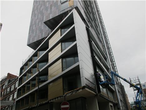 Student Castle - saw-toothed on the railway side, sitting on a podium
So did Hodder+Partners feel pressure to get things right given they were altering Manchester's skyline?
"When you're changing that aspect of the city, you do feel a responsibility," says Hodder. "You try and envisage the changes, how it will look when completed, its impact. You want it to contribute to the city, enhance the skyline not detract from it."
"At the same time we have to balance those considerations with quality and cost effective accommodation, fortunately we’ve had a good client and a good contactor. Delivering tall student accommodation is a challenge at the best of times."
But why is Student Castle fifty shades of grey, a pantone of muted tones?
"The client was interested in bright colours but we wanted to make it a lot more contextual," says Hodder. "The colours are of the Manchester sky but given variety and texture, just like the real thing."
Skyscrapers divide people like no other buildings.
For some they symbolise humanity's optimism and verve, for others they are egocentric phalluses displaying the worst side of mankind's bruisingly competitive character.
Personally I love them.
I'd like Manchester to have more of them. I think people who complain about skyscrapers would have us all still living in caves.
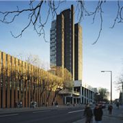 The lost Maths TowerThe CIS Tower and City Tower are classics, the loss of the Maths Tower by Scherrer and Hicks, in the last decade at the University was a city disgrace.
Look at Student Castle, look at the Maths Tower, and you have to wonder if in profile Hodder+Partners haven't given us something of the latter back.
Either way Student Castle boosts the south side of the city centre. It is a gentle and elegant presence but a welcome one. It's good for Manchester's skyline. Hodder + Partners seem to have got it right.
You can follow Jonathan Schofield on Twitter here @JonathSchofield
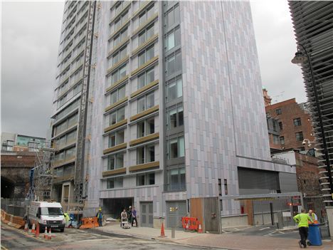 From Great Marlborough Street - the base
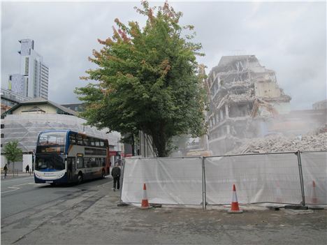 Student Castle with the former BBC building being demolished


