Jonathan Schofield on Denton Corker Marshall's Salford shocker
A conversational look at one of the dreariest new towers in the UK. In which we explore the who, what, where and WTF of this miserable monolith.
What and when?
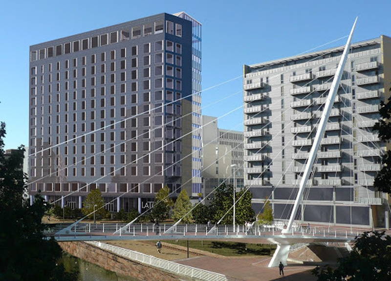
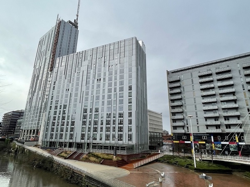
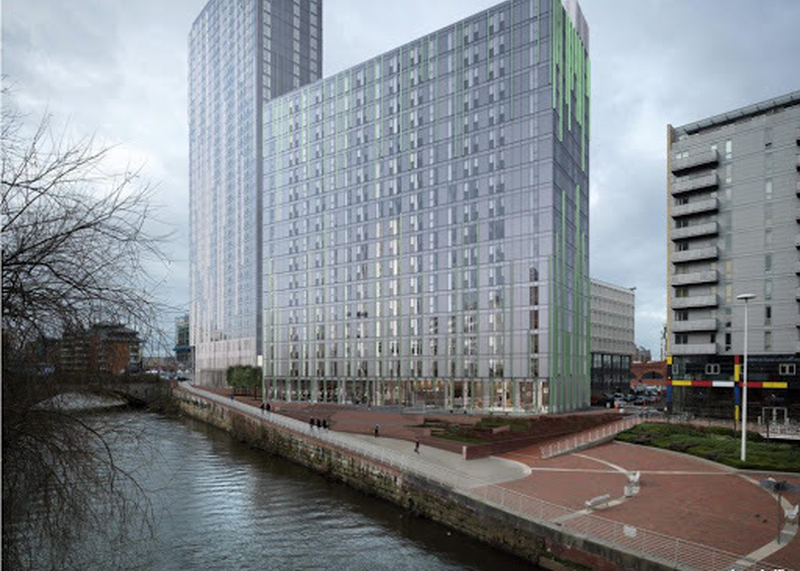
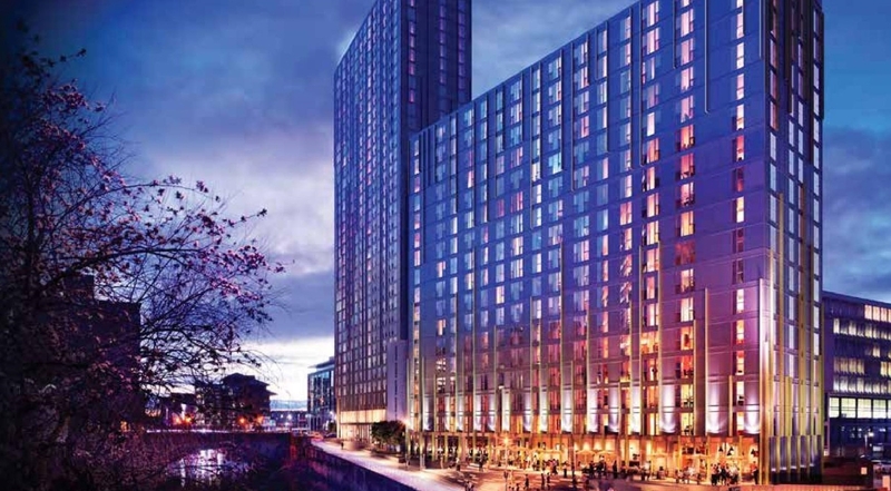
Riverview Tower, 318 apartments in a 35-storey, 118m (368ft) tower, nearing completion. Riverside Apartments 17 storeys and 190 apartments completed in 2020. They match each other.
Where are the towers?
On the banks of the Irwell, Salford side of the river, New Bailey Street, over from Bridge Street in Manchester city centre.
Is there a rotting corpse Dulux range being promoted in architectural journals notable for its death-like pallor?
Who’s involved?
The architects are the very prestigious Aussie practice Denton Corker Marshall (DCM) who also have a Manchester office. The developer is Select Property Group and the buildings are marketed under one of the latter’s consumer-facing brands, Affinity Living.
What do the architects say?
DCM's own description of the tower: "The highly prominent gateway location of the site required a building of exceptional design quality. We responded to this by proposing a simple architectural form expressed as a single billet of steel using silver metallic panels throughout the facade and natural anodised aluminium vertical fins to emphasise the slenderness of the massing."
What’s a ‘billet’?
Architects can be hilarious when they describe their own buildings, twisting the language so it ends up sounding like something processed through Google Translate. A billet is generally considered to be a civilian's house commandeered for soldiers' lodgings. This isn’t great when trying to attract residents to expensive flats in modern city centres. Or maybe DCM means the architectural term ‘billet’, a moulding with several bands of raised short cylinders or squares placed at regular intervals. That makes no sense, so maybe they don’t know what they saying, and just chucking words out that sound impressive yet are fundamentally meaningless.
What are other people saying about the building?
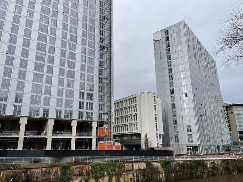
Everybody we talk to, inside and outside the industry, says this ‘single billet of steel’ and its shorter brother are crap. They are dull in shape and worse in shade. The way they meet the ground is grim too, which is supremely important in tall buildings. The tower is crowned by an off-centred cap. Off-centring is a bit of a DCM 'thing' but here it makes a boring building appear awkward and ungainly.
The Affinity Living pair are seemingly part of a stratagem by Salford’s planning department to ruin a river frontage which is so rich in potential, at a time when Manchester and Salford are trying to re-engage with the river.
What’s wrong with the colour?
Well, that’s just it, this pair don’t have a colour. DCM talk about them being ‘silver’. Except in the very brightest sunshine, they are nothing like it, they’re not even grey, more the shade of dead white flesh. Is there a 'Rotting Corpse' Dulux range being promoted in architectural journals notable for its death-like pallor?
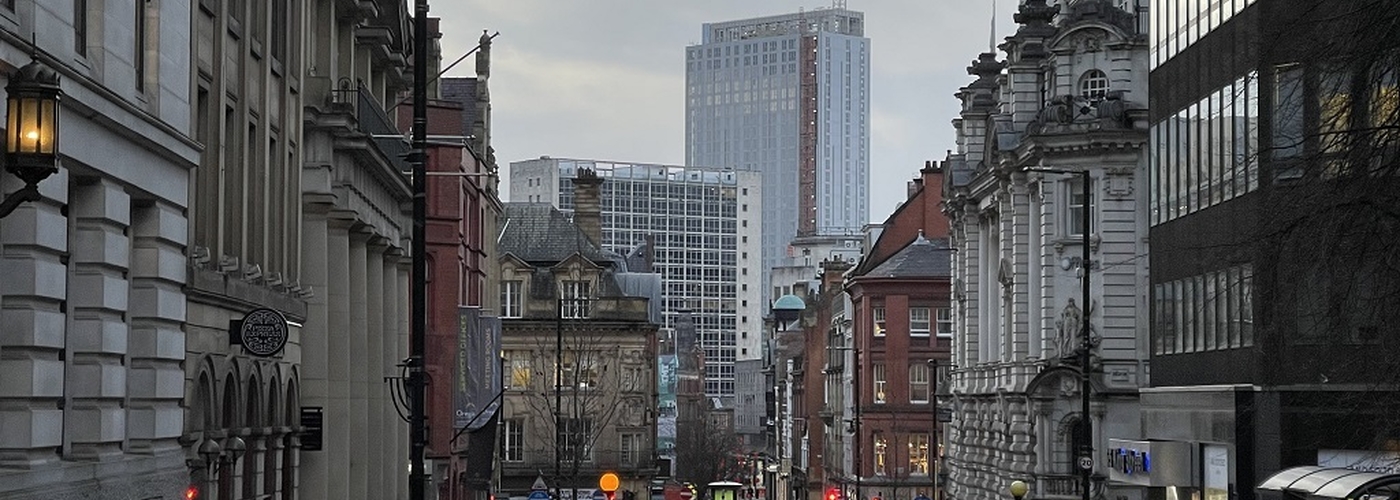
So why choose this offensively bland shape and shade if you acknowledge the location is a ‘highly prominent gateway’? Are architects, developers and planners unaware that we will have to live with such a tall 118m tower for fifty years or more? I suppose the only good news is the shade is very like a cloudy winter's day which means the building sometimes disappears.
What’s equally surprising is that DCM is an international architectural practice with a huge reputation. Take a look over its portfolio and this is their worst set of buildings by a mile. Curiously with Corpse Tower and its stumpy neighbour they’ve taken a dump in their own backyard.
What do you mean?
Two minutes walk away over the bridge is the Civil Justice Centre, a building of real verve, and as we’ve written before, bold in form and striking in silhouette (Our 2017 articles about Manchester’s best recent buildings had more on this). Of course, this building from 2007 had a huge budget, but it respected its role and location enough to deliver something memorable. And guess who the architects were?
You’re going to tell me Denton Corker Marshall?
Yep. Exactly. Riverview and Riverside on one bank of the Irwell and the Civil Justice Centre on the other, both buildings by DCM, now compare and contrast.
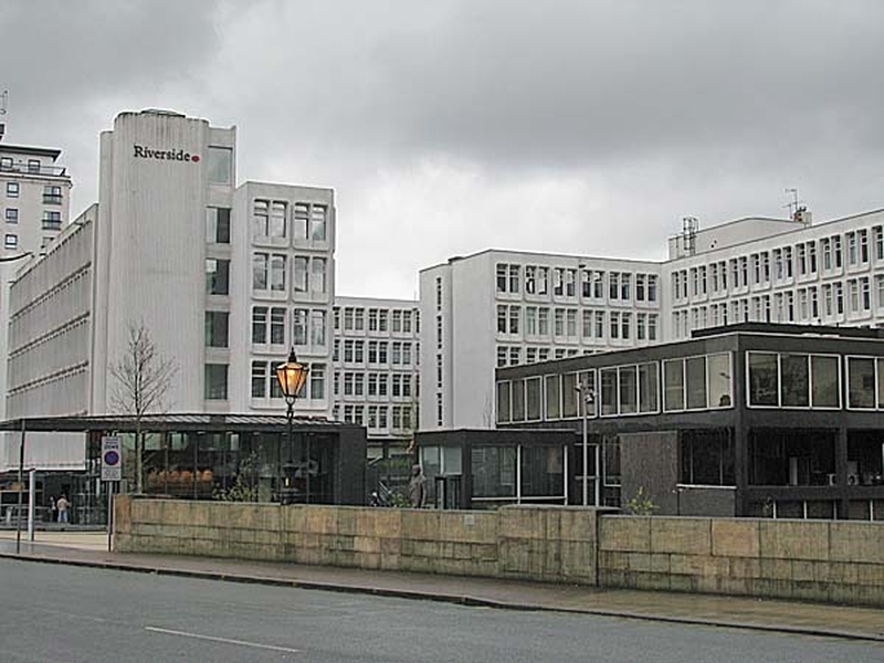
Another shame is Corpse Tower replaces a low-level classic from 1975, the black granite two-storey 'pavilion' of the former HQ of architectural practice Leach Rhodes & Walker, a ‘dark jewel’ of a building. Fortunately, its sparkling white neighbour, Aldine House, from 1967 also by Leach Rhodes & Walker, survives, with its interesting funnel-like windows. Leach Rhodes & Walker did very little that added to the city in the sixties and seventies but this grouping did and does.
Indeed Corpse Tower is put to shame by all its neighbours including the externally excellent (apparently its horrible inside) Albert Bridge House of HMRC, directly opposite. This is a confident building from 1959 by EH Banks and is clad in proper Portland stone. Spot the difference in quality with the weird stuff on the outside of Corpse Tower.
So how did Riverside and Riverview even gain planning permission from Salford?
A person intimate with the building process of planning, design and delivery said, "This is what can happen and often. Well-known architects are pushed to the front by the developers to oil the wheels with a council before planning consent. The council just see the economic development, and it's forget the location or any other measure, aside from the building being ‘all right’.
"Then value engineering takes place and, hey presto, the developers and architects come back and say, 'Actually this is a better design.' It isn’t usually, it’s just cheaper. Better bang for your buck. The result is that in such an important site you get the Affinity Living scheme. Councils need to learn to say, ‘No, that’s just shit, come back with something better.’ Because we have to walk past that thing for decades."
So, good, average or ugly? Silly question I know.
Ugly. Awful. Riverside is now easily the worst tower over 100m (£300 plus ft) in central Manchester and Salford delivered in the last ten years, by dint of weak, unadulterated blandness. Personally, I love tall buildings, especially on the ring of brownfield sites around the city centre but this is a shocking disappointment in the expanding traditional central area. Affinity Living? Affinity with what?
