Jonathan Schofield is excited about Hodder's new improved design for St Micheal’s
We really liked what we saw in August with the reworked design for St Michael's tower. This came during a presentation from the Gary Neville-led consortium which had ditched the original designs from MAKE architects and hired Manchester’s Hodder+Partners. The change of designer followed loud criticism from concerned Mancs, heritage lobbies and others.
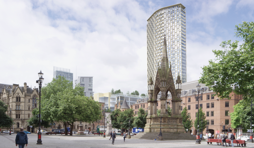
When Confidential saw Hodder’s replacement proposal we said: 'They have crafted a very tall and very distinctive building that combines boldness with sensitivity. Not only will St Michael’s, the 1.5 acre site between Deansgate and Southgate Street, benefit from the proposal illustrated on this page, the whole city centre will.
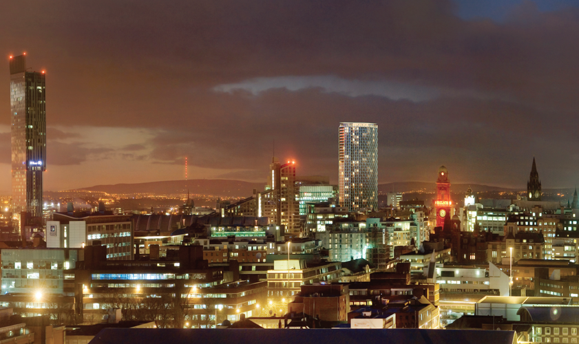
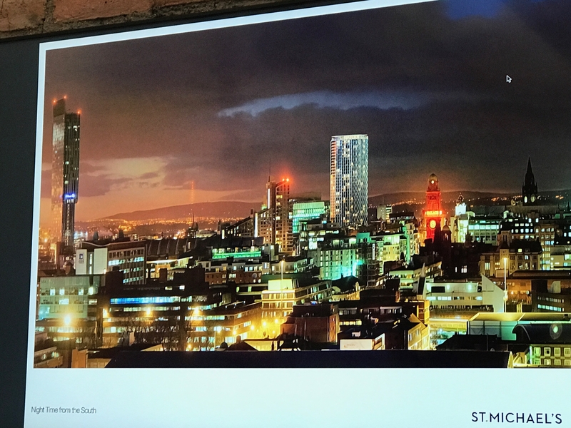
'The immensely satisfying and clearly defined diamond footprint of the 39-storey, 134.5m (442ft) tower will not dominate the nearby Town Hall and Central Library but, instead, add a very sharp, and, we hope, world class presence. Elegance can be bold, and this design proves that. It might not be going for broke but it will be something we will enjoy on the skyline.
That last line about 'going for broke' must have stirred something in Neville, because he went back to Stephen Hodder, explained that this would be his Manchester legacy building, and asked whether it could be pushed a little harder into making a real statement on the Manchester skyline.
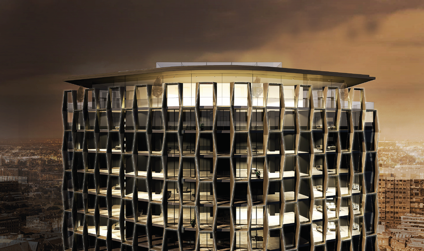
Aside from creating a superbly textured wrap, the building will now throw light off itself in myriad directions
Stephen Hodder says: “That gave me four days of racking my brain. We didn’t want to move away from the shape and form we had developed. Then it came to me.”
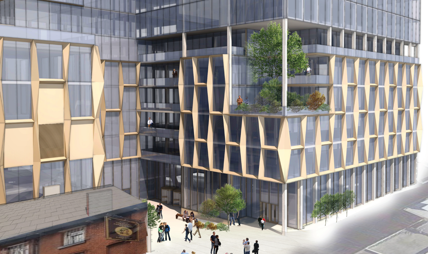
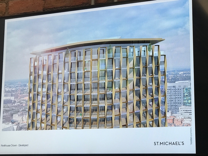
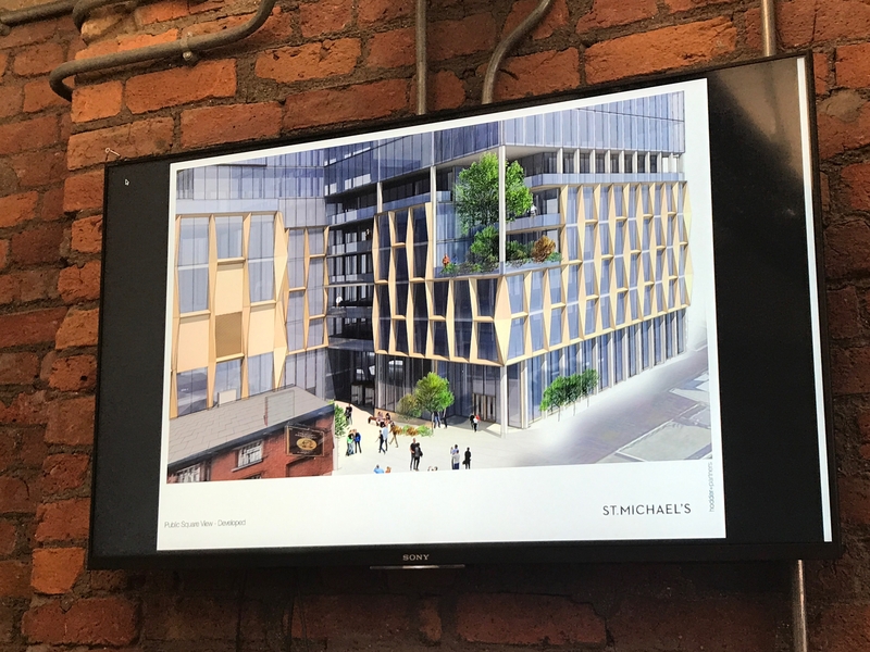
What came to Hodder was this: the verticals of the building, the long mullions between the windows, will be articulated, cut, carved, faceted and given a bronze-gold finish. Aside from creating a superbly textured wrap, the building will now throw light off itself in myriad directions as the day progresses and the weather changes. In the evening LED lights along the same elements will deliver a light show when required.
At the same time the lower office element that incorporates the façade of the former police station will also receive the same window treatment, thus livening the view up Bootle Street and Jackson’s Row.
Slideshow from meeting with Neville and Hodder:
"The clothes the building is wearing have changed. So we challenged ourselves and made it more exciting, dressed it better," says Neville.
"We now have sculpted vertical piers in bronze anodised aluminium," explains Hodder, "which retains the shape and creates a much more dynamic elevation."
Confidential wholeheartedly agrees with these new proposals. The continuation of the piers into the cap delivers a much more coherent termination to the building too. An already elegant and exciting building design has been improved and ramped up a few notches.
This should be a 134.5m (442ft) tower worth looking up to.
The revised proposal will be presented to planning on 10 November.


