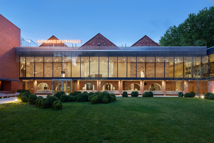
Jonathan Schofield on central Manchester's best architectural work of the last decade
Read - Manchester Buildings of the Last Ten Years: Part One
This week we look at university buildings, galleries, hotels, educational buildings, performance spaces, mixed-use spaces, squares and a couple of noteworthy wild cards.
Remember we have only allowed one entry per category so please feel free to tell us off in the comment section for our choices if you think we’ve left something out.
As with part one (above) there is a mix of refurbishment and new build. In one of these categories, hotels, there is only a refurbishment mentioned as none of the new build hotels seemed good enough to include.
For the record and speaking as the writer, if I had to choose a top six from part one and two, it would be (in no particular order): Chetham’s with Stoller Hall, Maggies, Central Library, Castlefield-Deansgate Station, St Peter’s Square and The Whitworth Art Gallery.
Let us know your favourites below in the comments...
University buildings
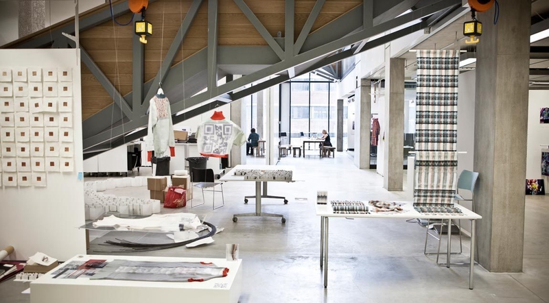
School of Art, Manchester Metropolitan Museum - 2014 - Feilden Clegg Bradley
The new building in this project, which included a total refurbishment of the 1960s School of Art, is a beauty: full of light, full of oak, with criss-crossing stairways and bridges that create movement and excitement while linking old with new. The way the building opens to allow you to see students at work in various disciplines is also invigorating as though looking through one of those cross-sections of castles and ships in kids’ books.
The RIBA summed it up when shortlisting it for the Stirling Prize: ‘The school combines gallery space, studios, workshops and teaching spaces. Different disciplines are encouraged to collaborate - fine arts, graphics and fashion work together and share spaces, learning from each other and sharing techniques and skills. It also has the look of a professional office, preparing students for life beyond their course.’ Understated on the outside, yet alluring too, this is fine addition to a fascinating part of the city.
Student Accommodation
Student Castle/Liberty Living - 2012 - Hodder + Partners
Another building that divides opinion, but Confidential appreciates this building for its variegated profile. It isn’t simply a straight up straight down box but gives the rapidly climbing skyline of the city extra character. At 106m (almost 350ft) it's one of the tallest buildings in the city. It cost £28.5m, is 37-storeys and provides self-contained studios and apartments for 520 people.
We asked Stephen Hodder of Hodder+Partners what he’d wanted from the building. “We wanted it tall, yet street relevant," he said. "We wanted that variety of profile too. We wanted it aesthetically, and we wanted it for practical reasons. There’s a single core with four components and each presents a different profile. The clusters from the west are higher, because you get more views of Student Castle from distance on that side, so you need them bigger. On Oxford Road the view is foreshortened and so the scale of the building is much more fragmented, giving it more variety and flow. We've tried to express that lower down as well. For instance the studio rooms look on to the railway, and are arranged in a saw-tooth so they look up and down the street rather than directly onto the railway.” The building succeeds because Hodder has delivered what he aspired to, not always inevitable in architecture.
New Educational and Entertainment
Chetham’s School of Music - 2012 & 2017 - stephenson STUDIO
Roger Stephenson said to Confidential: "This has been for me the best brief, the best project with the best clients. To design a building of this nature so that it makes an impression on the city for a long time has been a real privilege." The new building for Chetham’s School of Music and its 300 pupils is another massive plus for the north end of the city centre amongst a growing number of distinctive renovations and new build. This, though, is the sweetest. Here is a building of textured brickwork (a specially designed Chetham’s brick) that reflects the textures in the stone of Victoria Station and of the medieval buildings of Chetham’s. There’s a tactile quality to it, and despite echoes of Dutch Modernism, seems a design very apt for now - one that won’t date, just age with grace (a bit like Roger, himself).
The catlike wrap of the building culminates in the higher, prow-like element containing the Stoller Hall, which will be used for school performances and those of visiting stars. The 482 capacity hall arrived five years after the school and has a box within a box construction to prevent noise transference. The interior is dominated by the oil-lightened oak. The hall is a marvel of aesthetic and technical verve. The new Chetham’s School of Music and the Stoller Hall show just how good Manchester architecture can be. It pays heed to the site, it takes note of the importance of this oldest part of continuously inhabited Manchester, yet it is modern and monumental.
Cultural refurbishment/restoration
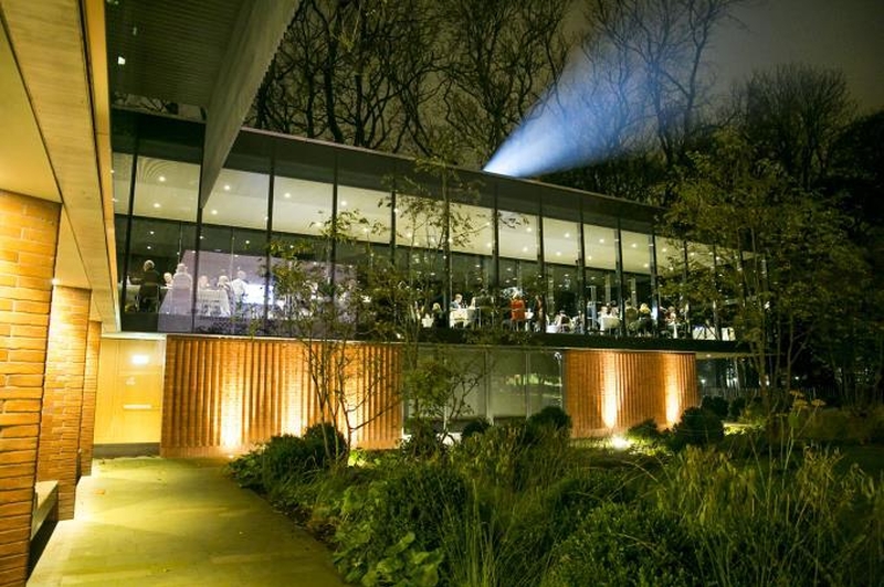
The Whitworth Art Gallery - 2015 - MUMA
This £15m refurbishment by MUMA architects doubles the exhibition space at the Whitworth, engages fully with the park outside, boosts the study areas and greatly enhances the catering and shop areas. It adds light, it adds subtlety, it opens the building out, it respects the qualities of the older buildings. It’s a paradigm of bringing an institution up-to-date. Part of the joy here is how the new work enhances and echoes the similarly skilful manner in which the 1960s interiors by Roger Bikerdike enhanced and improved upon the early 20th century façade by JW Beaumont architects. Cleverly, MUMA have created a Janus-building, with what constitutes an alternative façade on the west from Whitworth Park. There is lovely landscaping here too. The café seems to hang in the trees of the park and is a beautiful place to take a coffee or a wine.
Church refurbishment/restoration
Hallé St Peter's - 2013 - Buttress Architects
St Peter’s Church was originally built in 1859, designed by Isaac Holden who was the founder chairman of the Manchester Society of Architects (now Manchester Architects). Hallé St Peter's is the Hallé Orchestra’s rehearsal, recording and event venue in Ancoats and it’s a lovely, welcoming space, uplifting just as a church should be, even one that has been made secular. Holden’s design, incorporating large windows, has aided Buttress Architects in their task of producing a modern space in an old building but, as with the Timekeepers Square, their attention to detail is evident here.
Features to look out for include some impressive gasoliers on the ceiling that lit the space in former times. One stained glass window features the cross key symbol of St Peter. But the over-riding memory will be of the effortlessly repeating and utterly elegant and slender octagonal piers made out of cast iron crowned with equally elegant and eloquent leafy capitals.
Hotel conversion
The Principal Hotel - 2016 - 3DReid
It was a shabby and it needed shine because it had always shone, a terracotta jewel faded on Oxford Street. The hotel management brought in 3DReid and the former Refuge Building shines again as truly one of Manchester’s most spectacular buildings. Built in stages from 1893 to the 1930s, eye-popping areas such as the reception, the post room, the Directors stairs and the trading hall - now Refuge by Volta - produce instant ‘wows’ and show the care with which 3DReid in this reconstruction have treated the original. This despite the caging of a couple of columns in the bar area to provide an industrial aesthetic when the room was designed to impress industrial workers, taking them as far away from their smoky lives as possible. That silliness aside, take a trip up the stairs at one end of that main room and look back; the repeating arches, designed by Town Hall architect Alfred Waterhouse, and the gleam of the faience, produce a magical interior view.
Mixed use refurbishment/restoration
Royal Mills/Sedgwick Mills - 2012 - FSP Architects
This is a complicated site with buildings that date from 1818 to 1913, covering several stages of development in textile mill design. When these mills were at the height of their output Manchester, through the Royal Exchange, was the centre of 80% of global finished cotton production. Thus these structures lie at the heart of what made the city great. Take a look at the street pattern, and many of the older buildings in the city centre, and you'll see we still rattle around in the bones of those times. Derelict or part-used for decades, FSP Architects have created a glorious agglomeration of office, residential and retail space in difficult buildings, centred on a roofed courtyard with real scale.
Production still takes place in these factories, with the Ancoats Coffee Company brewing its own java. The best place to view the reconstruction is within the Ancoats Coffee Company and their courtyard terrace. Here, all feels contemporary, yet is suggestive of a time when Manchester didn’t aspire to be a Northern Powerhouse, but was a global powerhouse.
Public space
St Peter’s Square - 2017 - Latz + Partner
St Peter’s is the benchmark square in Manchester for future public space development. Designed by German landscape team Latz + Partner, and adorned with high quality street furniture plus lovely purple flowering paulownia trees, the square is a nigh-perfect triumph. The controversial transfer of the cenotaph from the south west to the north west of the square has also been a success and resulted in a far more apt and reverential location for this solemn monument, which now faces the sober and distinguished rear of the Town Hall, rather than a newsagents. The square might have been even better with fewer tramlines, particularly at the pinchpoint in front of Two St Peter’s Square.
This clean, sharp, hard-surface, clear design is right at the top-end of recent European work, bringing dignity and verve to a square that never previously functioned in any coherent fashion. The square now acts as a perfect foil for the Midland Hotel, Central Library, the Town Hall Extension, Manchester Art Gallery and the two new buildings on the east side, especially the marvellous One St Peter's Square by Glen Howell Architects.

Wildcard One
42nd Street - 2012 - Maurice Shapero with Bradshaw, Gass & Hope
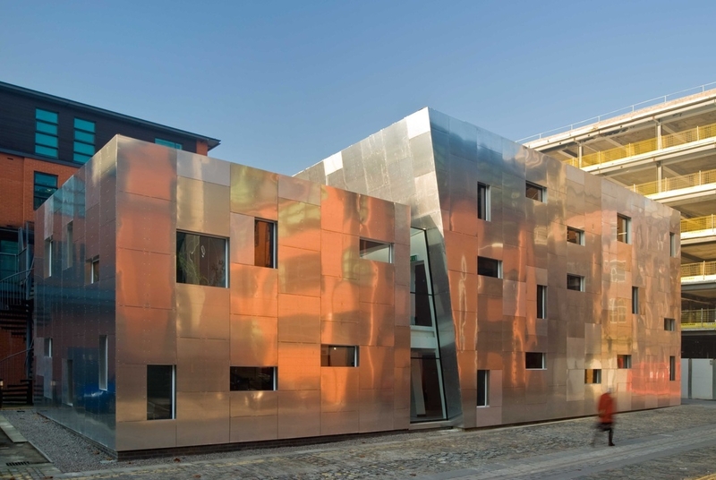
This extraordinary building is a response to the challenge of housing a charity for troubled youth, namely 42nd Street. It’s a magic trick that lifts the mood in Ancoats, a building full of whimsy perhaps, but full of fantasy too. The dramatic white steel gates visible from Great Ancoats Street only hint at the full measure of the architect's design in all its brushed aluminium glory.
The interior is as crazy as the exterior but seems genuinely loved by the staff and the kids that visit. As Shapero, the concept designer, writes, ‘Once inside be prepared for the unexpected: tapering stairs, angled rooms, leaning walls, a corridor to nowhere - and wardrobes which are passages to the psychologically protected land of one-to-one therapy.’ Narnia then. Most people will only get to gaze on the outside, but take time to study all the aspects of that, by turning left off Great Ancoats Street and on to Jersey Street to view the glowing aluminium rear.
Wildcard Two
Maggie's - 2015 - Foster + Partners
Ok, ok, this isn’t in the central areas of the city but Foster+Partners have designed a glorious building in Withington that needs to be highlighted as much as it can, if nothing else because it needs constant financial support. Maggie's Centres across the country provide 'free, practical, emotional and social support for people with cancer and their family and friends'. Mancunian ‘starchitect’ Norman Foster (with Dan Pearson's landscaping skills) has designed a building so light it seems to float a foot or two above the ground. The lightness is appropriate, Norman Foster pilots his own helicopters and planes, and his design here is intended to resemble an aeroplane, with the upper fuselage the offices of the building, and a cockpit viewing area looking into the nose, which is filled with flowers and colour year round. The rooms on each side of the 'fuselage', with their huge windows, seem to evaporate into the gardens.
This is Foster and Dan Pearson's best trick, they have made the building and garden appear as a single entity, a seamless whole. Meanwhile the engineering of the timber elements is a sweet marvel. You can't help but rub your hands down them. You can't help smiling as you walk into Maggie's and this exactly as it should be. As the boss of the building, Sinnead Collins, said to Confidential, "People need more than medicine."


