Category: Good, average, ugly and excellent
These are odd objects
Aren’t they just? But they’re crackers too. Did you know there's a castle wall in Manchester? Have you seen the three demons hanging around a Salford campus? And how did a mad 60s wall get abused by a bus stop on Corporation Street.
Slow down, tell me more about these features?
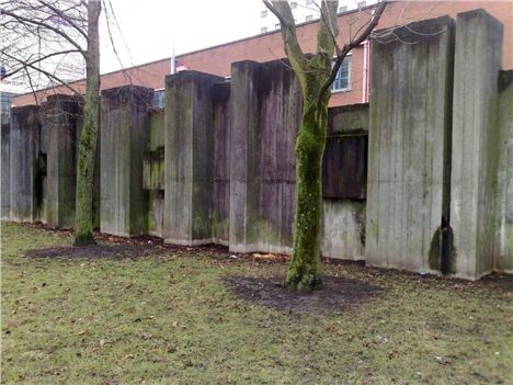
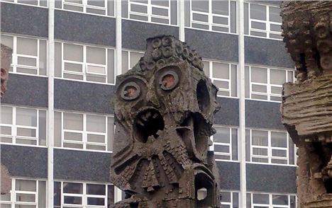
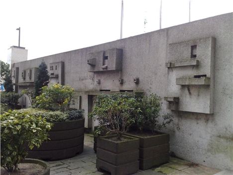
The concrete castle wall on London Road, just before the Mancunian Way, was designed by Tony Holloway and installed in 1968. Holloway also did the stained glass windows on the west side of the Cathedral. The monsters are an artwork collectively called 'Untitled' by William Mitchell from 1966 on the Frederick Road Campus of Salford University. Mitchell more famously worked on the RC Cathedral in Liverpool with the bell tower designs. He also worked on the CIS building. The latter’s neighbour is New Century Hall, with its little porcessional way flanked by John McCarthy’s abstract screen and fountain from 1962.
Manchester's battlements
Tell me more about the wall? It’s not really from a castle is it?
No, it’s a 'sound-buffer’ for the Engineering Pilot Plant building by Harry S Fairhurst. Fairhurst and Holloway were buddies. Get up close to the wall and its impressive, ten times better than Tadao Ando’s concrete thingy in Piccadilly Gardens. It’s full of solemn power, and bashed about grandeur. But above all it's simply weird, drawing you in with its stop you in the street, ‘you-what?’ magnetism.
And those Salford monsters? Come on they’re horrible.
Matter of opinion I suppose but I love them. At first sight they seem as dated as footage from Woodstock with beads, mini-skirts and headbands. But get up close again, walk around them, peep into their nooks and crannies, rub your hands over their folds and bulges, and there’s a certain sensual attractive horror to them. Mitchell deliberately mixed up the colour scheme, the types of concrete and even included bits of mosaic. He was a bugger though in offering no interpretation of what they might mean although we know he was having an 'Aztec moment'? Are we looking at urban alienation? The good news is that in 2012 these beasts were Grade II listed - you can read the English Heritage description here.
Screaming on the campus
And the John McCarthy work
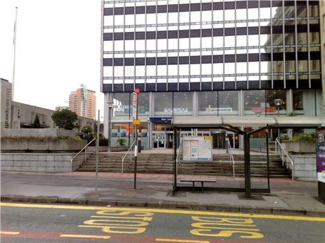
This is the most modest of the three, an attractive screen wall to Miller Street to make a processional way of the entrance to New Century Hall. New Century Hall was and is a convention and exhibition centre. The processional way was bordered on one side by an older building and approached by steps from Cross Street. The wall presents an interesting and variegated set of brackets from which water was supposed to flow. It’s the most abused of our concrete features, attacked by a forest of potted plants as though The Cooperative is ashamed of it. It's also masked by the most incompetently sited bus stop in the land.
So what do you find appealing about these strange 'objets' on the Mancunian landscape?
Three things. Firstly, they embody that very sixties and Modernist ideal of the all the arts coming together, the fine and plastic arts inseparable from architecture. This was by no means the first time this had happened of course. Indeed it’s a recurring theme of design. The Town Hall by Alfred Waterhouse of 1877 was built along the same lines although the techniques and styles were different: a place where sculpture, mosaic and fine art came together, including the murals by Ford Madox Brown.
And what else?
They’re reminders of that wave of fifties and early sixties optimism which was still informing artists. This was about to be blown away by Vietnam, Paris Riots, the oil crisis and a rejection of the hard windy inhuman cold perfection of Modernist design. They're reminders of a time when designers thought a modern approach using modern materials and driven by the machine and technological age was just the ticket. They're exciting for that and in their own right as objects.
That’s only two reasons, the third now please.
All cities need context. As we walk through them we need to feel the layers of the city’s history under our feet. It’s best if a city provides a visual reminder in odd tucked away corners – Holloway’s Wall – or right in your face – Mitchell’s three giants - of what it was before and how it then looked on the world and itself. These concrete features do this, they’re not only a physical reminder of the time in which they were built, but also of the mood of that period in our history. Many people will probably bracket these bits and bods as brutal reminders of washed up 60s' tastelessness. Many probably think that the sooner they go the better. That would be our loss, I reckon. They tell us a little bit about who we are and were, they're part of the family of buildings in Manchester. You wouldn't kill off your grandma just because she wears old clothes would you? Although maybe the is need for some form of euthanasia for some of the concrete mania of the sixties and seventies.
Such as?
Well Highland House for example as noted in this Confidential article. But the examples on this page of an aesthetic that slumped deep only to make a recovery in the last few years should be retained. As explained above, they add to the context of a city, tell a story.
You can follow Jonathan Schofield on Twitter @JonathSchofield or connect via Google+


