Jonathan Schofield finds an explanation leads to more questions
It's down to a question of height.
5Plus Architects, the Manchester-based practice making waves in the world of design, have modified their controversial Shudehill scheme.
They’ve lowered it by about four metres.
They shouldn’t have bothered.
Yet, sitting in the 5Plus office listening to their director Phil Doyle explain how the design for this building was developed, you see how much they are bothered.
“We have our office in the Northern Quarter, we love the Northern Quarter, we want to make it better, not worse,” Doyle says, patiently explaining the history of the site and how it has changed over the last couple of centuries.
He also describes the planning and conservation hoops architects have to leap through, the letters that have to be sent, the consultations they have to attend. It’s a side of the process of making plans a physical reality that, unless you're in the business, you never learn about.
During the consultancy a couple in a flat close by had complained that their view was going to be compromised, so Doyle visited them and talked them through what might happen at their end of their scheme. He cares, you see.
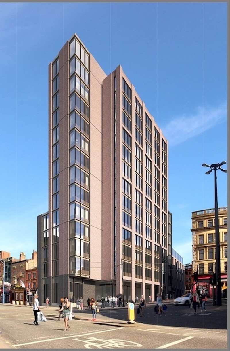
The site is complex, stretching more than 70 metres from Shudehill east towards High Street. The new building will fill the long narrow site between Back Turner Street and Soap Street, taking the place of a bunch of buildings that have been either cropped, destroyed or are in the process of falling down.
It has been brought forward by Tibst, a joint venture between Salboy and Factory Estates, and pre-let to Zoku, a stylish Dutch apart-hotel company with just one other property in Amsterdam. There will be 122 guestrooms for what Zoku, somewhat laughably, describe as ‘global nomads’. God save us.
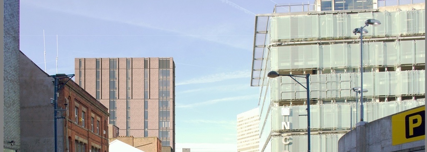
5Plus have been respectful of the existing buildings on High Street, matching the building height on that side. Then the design rises up in three stages to the 43m (141ft) tower on Shudehill. The central element is particularly strong, matching the tough nineteenth century iron framed grid of windows on the other side of Back Turner Street.
With activity at ground level on both sides of the building not only will it animate the narrow streets here, it will make them safer.
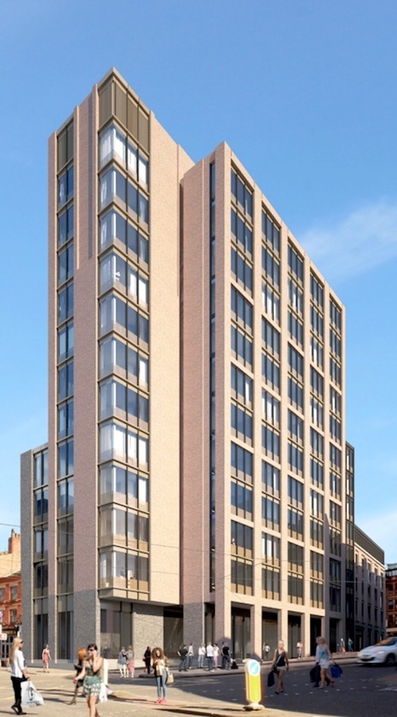
So far so good. The only real argument is over the height at Shudehill, which towers over the late Georgian buildings adjoining to the north. So while deference has been paid to the older structures on High Street, none is paid to those on Shudehill.
Doyle excuses this by referencing other taller structures such as Shudehill Transport Interchange and the spiralling car park access at the arse-end of Manchester Arndale. It’s not a very convincing argument. Essentially this is the design they wanted and of a scale that would attract the client. If they had wanted to recognise the scale of the Georgian structures they could have put the tower in the middle of the long building.
Still, Manchester has always been a pragmatic city in which change is constant, as it should be with cities. We are not Stratford-upon-Avon.
5Plus can just about get away with this here because it is on the fringe of the Northern Quarter. Further in and it would be a travesty and they know this. Here on a main road, at the particularly ugly junction of Shudehill and Nicholas Croft, the fact it sticks out like a sore thumb beside its neighbours is perhaps justifiable.
In fact, the only question, since they’ve broken that roofline of the older buildings, is why they didn’t go higher, rather than knocking off four metres? That seems like a pointless sop. As stated at the start of the article, they shouldn’t have bothered; 143ft tall or 300ft tall becomes irrelevant once that scale has been broken.
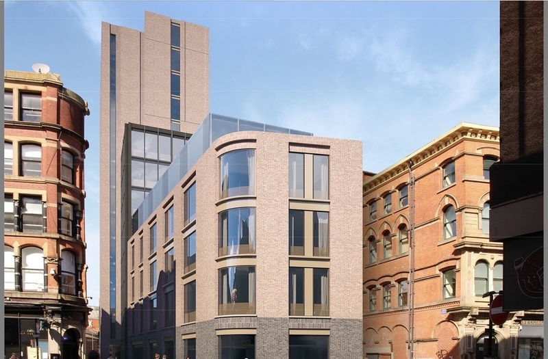
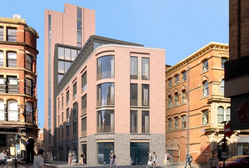
It was good to have Doyle explain the process by which the design for the proposed new building came about. But in reality nothing much has changed of the controversial design which got so many people ruby-faced and fist-pumping on social media.
Indeed it left Confidential with another question, and another demand. The Zoku building is at both ends clad in brick panels that are not in any way structural. At the lower east end, these panels sort of fit the street scene, but rising up 43 metres on the Shudehill side the panels are unconvincing.
Confidential would love a moratorium on the use of brick panels on tall buildings across the city for ten years. Please, raised to that height they begin to look very, very drab.


