Category: Ugly and mad
What?
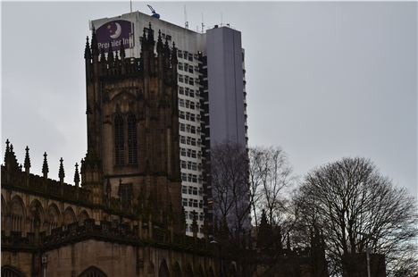
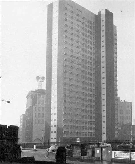
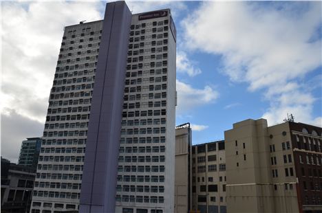
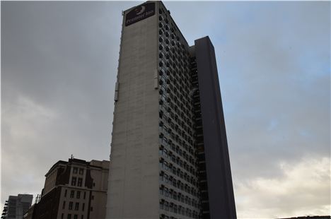
Highland House as it was and now North Tower, just over the river in Salford from Manchester Cathedral.
When?
1966
Who?
Leach Rhodes Walker, the prolific architects who have re-imagined Manchester city centre across five decades in a manner that is three parts bad, one part good. Terrible this building and others such as Heron House in Albert Square, tolerable St Andrew's House (now Manchester One) on Portland Street, good, their own offices on New Bailey Street a short walk from Highland House. Bless 'em.
Cheap metal, dreadful colour, were the recent refurbishment people a bit thick? Did think this was acceptable for opposite the Cathedral?
Why’ve you picked this building?
It needs to go. Let's sing Salford's unofficial anthem from Ewan MacColl's Dirty Old Town: 'I'm going to make me a good sharp axe/ Shining steel tempered in the fire/ Will chop you down like an old dead tree.' This slob of a sixties building lurks over a fundamental part of the city like a dirty old man in a mac. It shames the area.
After the Romans departed Castlefield, the site of Manchester Cathedral is where the Saxons settled. So this area is where Manchester and Salford really came into being, this is where they first kissed and where they eventually spanned the Irwell with a bridge. It's where doomed Royalists fought with Parliamentarians, it's where Bonnie Prince Charlie crossed into Manchester and where a famous nineteenth century market was held. It's the place from where all modern Manchester and Salford spread and now it's an area undergoing huge improvements.
But back in the sixties Highland House/North Tower was built. Idiots.
Nice positioning. The Cathedral Tower knackered by Highland House/ North Tower
Describe it more
It's 23 floors over a podium, it was once Inland Revenue offices, now it's half Premier Inn and half apartments, with the hotel in the lower part. It's construction was innovative if nothing else.
As the Manchester Modernists state on their website: 'for Highland House, a central core was made with a continuously climbing shutter (sliding shutters which rise at 15-38 cm per hour while concrete is poured and reinforcements are put in place) whilst pre-cast concrete cladding panels made off site were lifted into position by tower crane. this brand new technique with its absence of scaffolding was cost effective and uber speedy, enabling clients to actually move in to lower floors whilst the upper floors were still being constructed.' (If you wonder why there are no capital letters at the begining of sentences in this quotation it's because that's how our new Manchester Modernists wrote the paragraph. It must be a Modernist thing - those crazy radicals.)
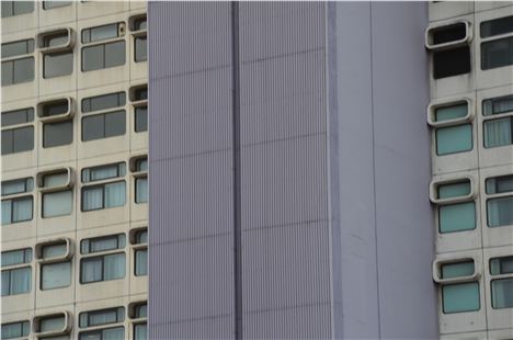
The distinctive feature of the building are the sticky-out portholes all the way up the building. The funny thing about these is that the original steel versions blew out during a storm and scattered themselves about the nearby Salford Bus Station (now Greengate Square) fortunately missing the good citizens beneath.
The Manchester Modernist's also say: 'in 2004 the president of RIBA declared (Highland House) ‘dreadful’, adding that it should be demolished, but to our mind this is a little slice of space age futurism bridging that imagined frontier between Salford and Manchester. long may it prosper…'
This surprises me
Because you think it's bobbins?
Yes. It's worse than bobbins, it's in such a shocking position with reference to the Cathedral its almost as though Salford planners were aiming a deliberate insult at Manchester - cocking-a-snoop as they say in the pubs of Lower Broughton.
But if in 1966 it was all wrong, now it's ten times worse. The two tone of the original has become a dirty white, the service shaft has been painted Premier Inn's favourite shade of purple and faded to a muddy lilac and become masked behind corrugated iron which might have cost as much as £17.25. The entrance to the hotel looks like it belongs to an STD clinic tucked down a back alley if you forgive the expression. Leach Rhodes Walkers' dodgy building of 1966 is an unmitigated horror at present.
Highland House in the sixties
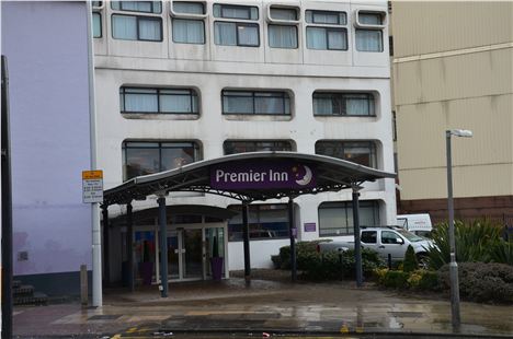 Are you joking with this piece of asinine crap for an entrance?
So why do people such as the Modernists like it?
I suspect they're a bit evangelical, a bit religious. Or maybe utopians, thinking there is a lost country of righteousness to which we need to find our way home. Certainly it seems these post-Modernism Modernists feel the decades of concrete addiction must be defended at all points in all their 'white heat of technology' glory.
That dogma cannot be diluted even here when Highland House/North Tower is so obviously sited in the wrong place and is now so debased it looks like a place zombies might love to lurk come World War Z.
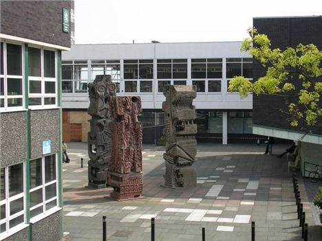
Of course there is excellent concrete work around the city, so let's not get all Prince Charles here. The former UMIST campus gets a big thumbs up, City Tower likewise, as well as Mitchell's crazy 'totem' sculptures at Salford Uni's Frederick Road campus, but there's also heaps of stuff that's had its day. (You can read all about Mitchell's monsters and other lumpy concrete art here on Confidential.)
Mitchell's perfect concrete sculptures, totems of a middle-class art construct that thought itself so very democratic but was genuinely positive about a new direction in art.
I love this quote from Malcolm MacEwan in Crisis in Architecture from 1974.
'Concrete caught on, in part, because it seemed to be a cheap and very plastic material. But in fact, to produce high quality and durable concrete finishes has proved to be both difficult and costly, and it called for a practical design skill and knowledge of the material that most architects lacked. The innummerable buildings with drab, grey, begrimmed, streaky, cracked finishes, designed with little understanding of drips and weathering, or designed to be covered with paint that the client cannot afford, are silent witnesses to the technological inadequacy of the architectural profession, which was carried away by images that could not be realised within the limits of its skill, the resources of industry and the cash available. The use and abuse of concrete perhaps more than anything else, account for the hostility to many recent buildings and to the architects who are rightly held responsible for them.'
As the pompous ass with his hands steepled will say when his own views are vindicated: "Quite."
It's all something for the Elected Mayor in 2017.
What about the Elected Mayor?
So when the Elected Mayor, a person who of course should have the good grace to accord with all I personally desire, ascends to the throne of Greater Manchester and - unlike the Manchester Modernists, let's capitalise these words - assumes Supreme Planning Powers and makes Strategic Decisions, I say let her/him decide to smash this foolish building to motorway aggregate. Beautification should be part of the Elected Mayor's remit. Along with efficient bureaucracies, let their be beautification, so that sites like this can be cleared and landscaped to allow room to breathe for the historic heart of the twin cities.
You can always hope, can't you?
You can follow Jonathan Schofield on Twitter @JonathSchofield or connect via Google+


