IN a planet of conflict and mayhem it is one of the few constants.
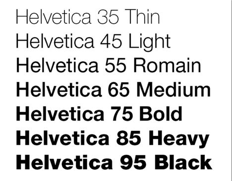
Helvetica: created by Max Miedinger with Eduard Hoffmann in Switzerland, in 1957, oOvernight it became the favourite font of graphic designers the world over. They loved its its quiet power and neutrality.
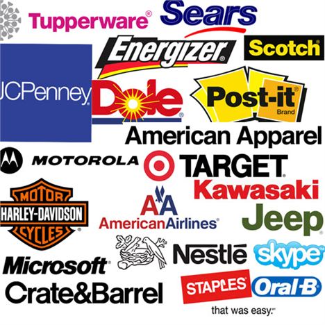
In the half century since, Helvetica has dominated modern life, used in logos by everyone, everywhere. Magazines, newspapers, airliines, banks, ketchup.
Like yellow cars and the number 23, once you see it, you won't be able to stop seeing it.
Unlike many other fonts, Helvetica takes a back seat and allows the message to do the work. But its moment in the spotlight came in 2007 when director Gary Hustwit made a film about it.
Helvetica - a documentary about typography, design and global visual culture will be shown at FACT this Wednesday (February 4) as part of its current Type Motion exhibition.
It will be followed by a panel discussion where designers debate Helvetica’s glorified status and the symbiosis between design and typography.
One for typography nutters? Maybe. But they are not alone. Even those zany wags at Google got in on the act on 2011's April Fools Day. If a user attempted to search for the term “Helvetica” using its engine, the results would be displayed in Comic Sans.
Google, what are you like?
Helvetica (80m), FACT, Wood Street. Wednesday February 4, 6.30pm. Adult tickets £10.


